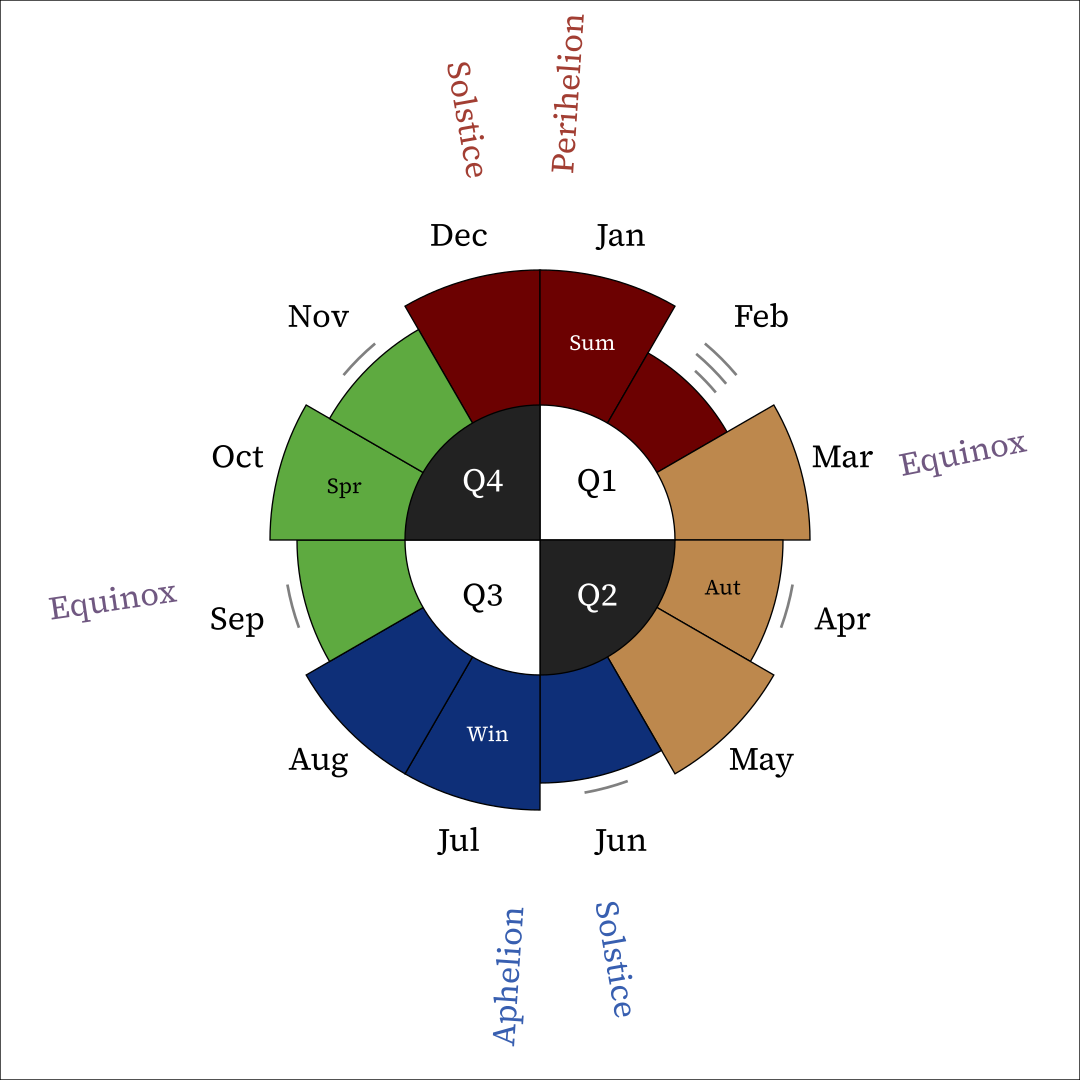
Year Clock
Here’s a little infographic I made that makes sense of the Gregorian calendar.
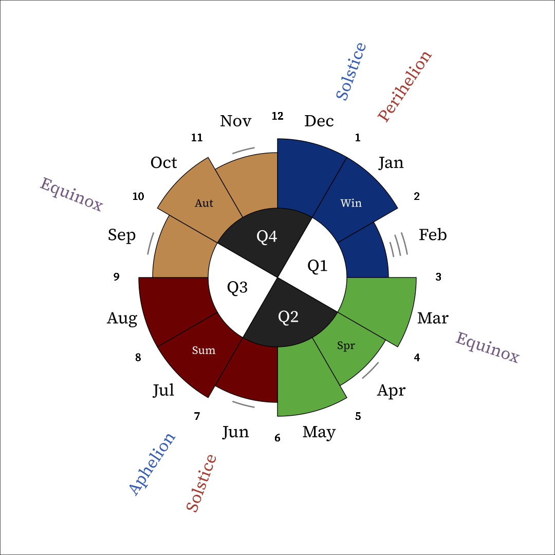
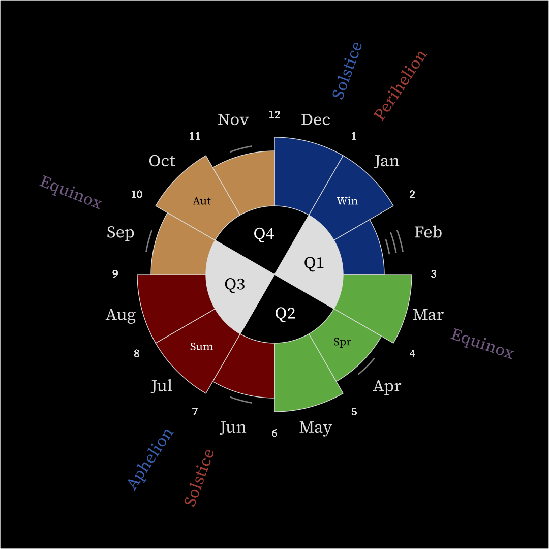
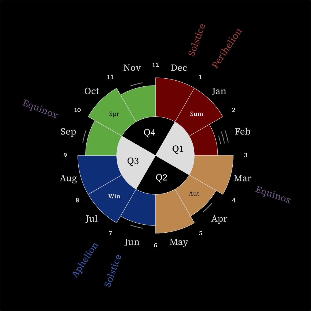
It’s parameterized by color theme, hemisphere, and tilt, resulting in eight variants. The above is light-themed, northern hemisphere, and season-aligned. Here’s the dark-themed, southern hemisphere, year-aligned variant for comparison.
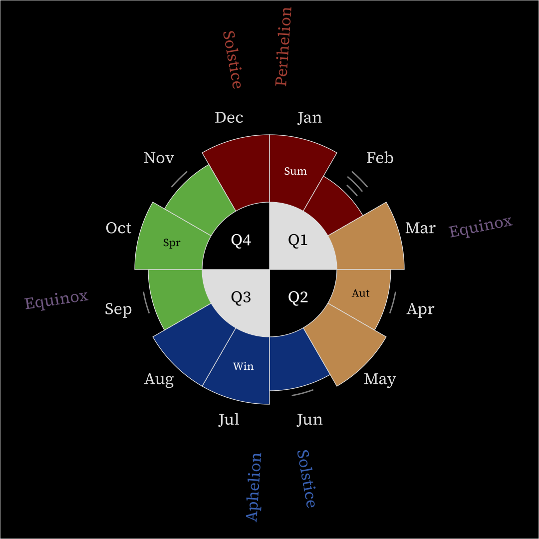
Each variant has a PDF version (for printing) and a 1080×1080 WEBP version (for desktop backgrounds).
Here are links to each version of each variant. (I don’t recommend printing the dark-themed ones, though.)
| Color Theme | Alignment | Hemisphere | |
| Northern | Southern | ||
|---|---|---|---|
| Light | Season |
PDF WEBP |
PDF WEBP |
| Year |
PDF WEBP |
PDF WEBP |
|
| Dark | Season |
PDF WEBP |
PDF WEBP |
| Year |
PDF WEBP |
PDF WEBP |
|
Motivation
Given a particular month, I find it hard to call to mind:
- What season is it in? Early, middle, or late?
- What season is it for my friends on the other side of the planet?
- What quarter is it in? Early, middle, or late?
- How many days are in it?
- Is there an equinox or solstice in it? (December is easy, but not the rest.)
- What’s its number? (Not a problem for me anymore, but it took some deliberate practice to learn it.)
- How much of the year is left? (It takes a laborious few seconds to figure out that e.g. the beginning of May is about ⅓ of the way through the year.)
Most of these problems don’t have mnemonics you can learn. The one mnemonic I’m aware of, “30 days hath September, October, November, and December,” is very difficult to remember correctly.
Better to just see what’s going on visually using a nice diagram on your wall.
Design
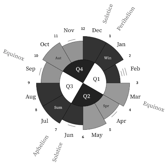
Each month’s length is represented by the length/radius of its slice. They are each allocated an equal 30 degrees of the circle regardless of how long they are. Shorter months have a tick representing how many days are missing out of a full 31. February is missing 2 ¾ days because a leap year happens every 4 years, usually.
Month numbers are only shown on the season-aligned variants because there they correspond to where the numbers go on a regular 12-hour clock.
I went with Source Serif 4 as the text font after fussing with a bunch of different free font options. The line width variation and serifs aren’t obnoxious, and the designs are better thought out than in Noto.
The solstices, equinoxes, and apsides are labeled at an angle corresponding to their average position within their month. They’re color-coded blue for cold, red for hot, and purple for temperate.
If not for the color-coding (red = hot = close, blue = cold = far), I personally would struggle to remember which of the aphelion and perihelion is which.
Seasons and quarters are labeled and color-coded.
The color choices are intended to be at least somewhat robust to poor-quality printers and colorblindness.
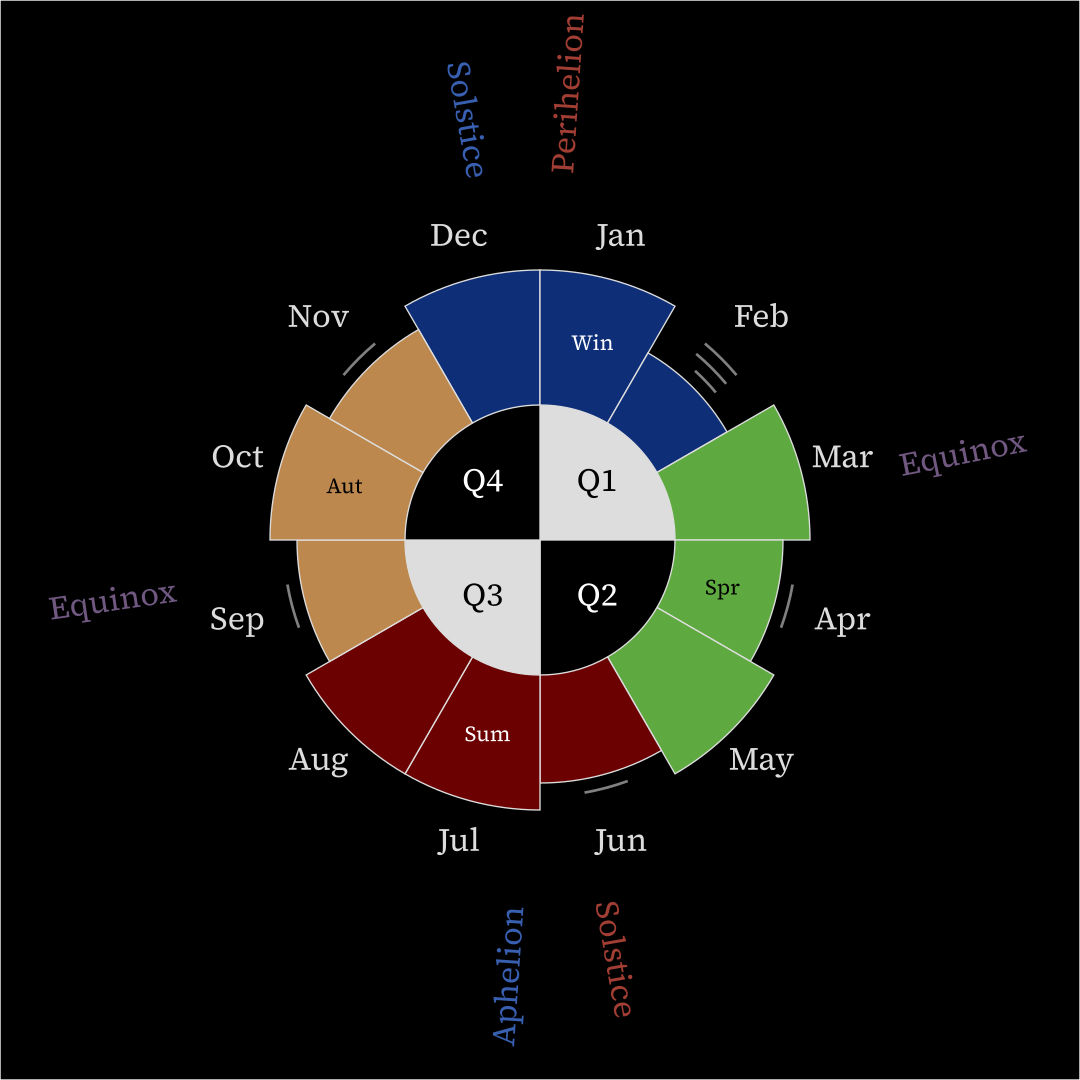
Here’s the result when I convert the first image above to grayscale using GIMP. (It’s scaled and cropped too.)
Most text is black or white depending on the color around it. Summer and winter are dark, spring and fall are light, and the color for each quarter contrasts with the color of the season it has the most overlap with. The hot–cold color distinction in the spokes is lost in grayscale, but it isn’t exactly necessary anyway.
There are a lot of types of colorblindness out there, but hopefully this works well enough for most of them?
The grayscale version depicts what the lightness of each color is theoretically, but implementations aren’t quite right in practice. I notice that green in particular seems a bit too light on my monitor and too dark when printed by a particular mediocre printer. Oh well.
Possible improvements
If there’s interest, I might publish the code used to generate the images somewhere to enable tinkerers to tinker with it.
It would be nice to let said tinkerers put custom holidays into the image, a feature I’ve halfway implemented already, but it’s not there yet. This would also let people who don’t care about apsides (i.e. most people) turn those off, though I could also make apsideslessness a togglable flag instead.
I notice that in the WEBP rasterization, the clock numbers seem slightly more pixelated than everything else. Neither I nor our robot overlords have been able to figure out why, but maybe we will someday.
Currently, the light and dark themes share mostly the same colors, but the dark theme version might look a little nicer with slightly different ones.
There exist SVG versions of each image, but currently they’re big, clunky, and don’t render properly in most environments. In the future I might make both tiny SVG versions that require Source Serif 4 to render properly and bigger SVG versions that convert the text to paths so you won’t need the font.
Technical notes
A Python script generates SVG files, then Inkscape converts those SVG files to PNG and PDF, and ImageMagick converts the PNGs to WEBPs, losslessly reducing their size by more than half.
It’s been a couple years since I’ve had any problems with WEBP support, so I’m converted.
Inkscape seems to understand CSS in a style tag but
chooses not to use it, so I had to do inline styling for every element.
The result is that the SVG files of the numbered variants are more than
double the size of the year-aligned ones and are about the same size as
the WEBP rasterizations.
Inkscape is allegedly able to convert text to paths via the command line, but neither I nor the AIs were able to get it to work on my machine.
At some point I installed a different version of Inkscape, which seems to have screwed up some rendering dependency somewhere because the angled text no longer renders in Inkscape nor in my image viewer nor in my file manager’s thumbnails, even after switching back to the other version. It does still work in Firefox and Chromium, so it’s probably not a problem with the SVGs themselves. I had to transfer my code to another Linux instance, change the Python slightly because it’s running Python 3.10 instead of 3.14 for some reason, and then render everything over there.
Everything about actually putting this together was frustrating, but the design part was fun and the thing’s useful now that it’s finished.